BRIGHTON AND HOVE BUSES Project type: CONSULTANCY
Project steps:
- Interior design concept
- Design development and sourcing
- Detail drawings and specification
- Trades liason
- Installation

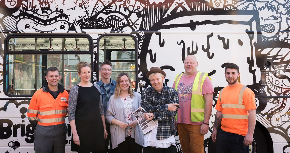
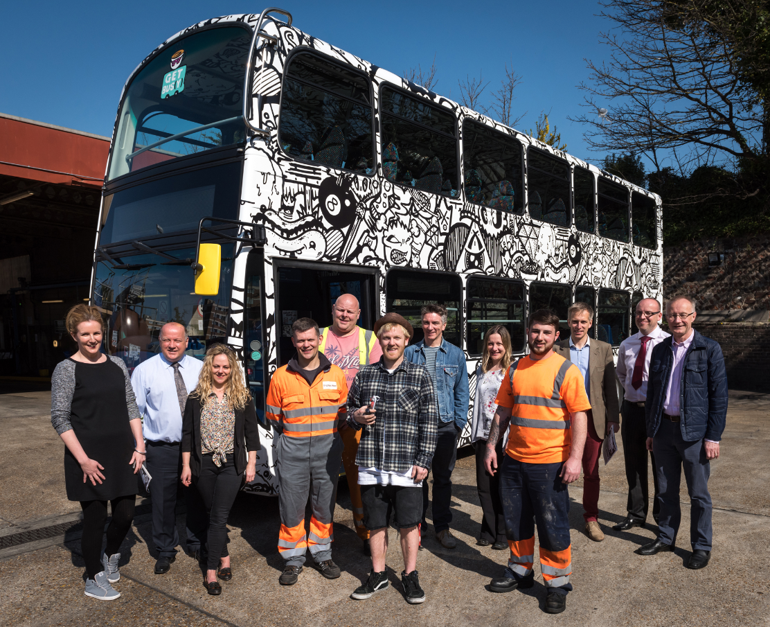
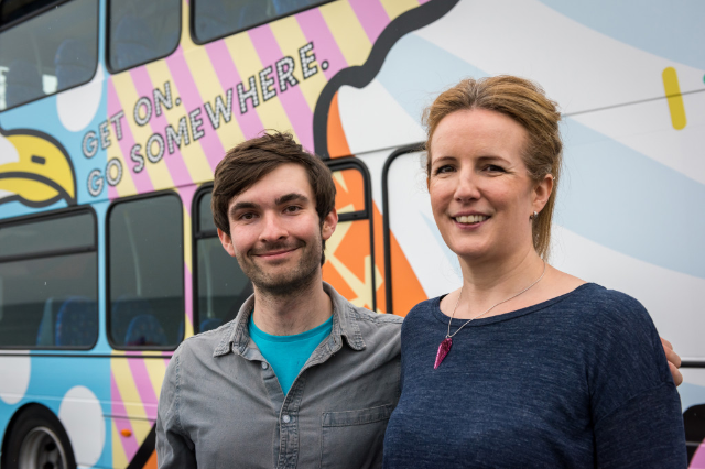
I was approached by destination marketing specialists Blue Sail for their client Brighton and Hove Bus Company to be part of the project’s design team, working alongside Chris Harrison of Harrison Agency for the bus company’s ‘Get Bus(y)’ destination marketing campaign.
Harrison Agency had developed the strategy of three individually themed buses, with the aim to encourage bus use to reach local destinations. Brighton’s North Laine being the first theme, with the Beach and the South Downs to follow, launched at intervals throughout Summer ’15.

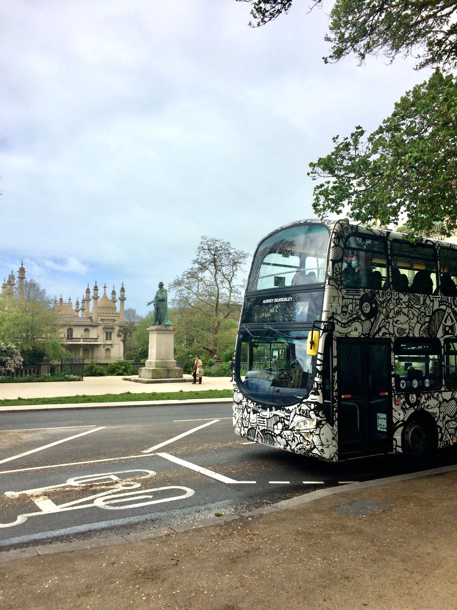
NORTH LAINE BUS
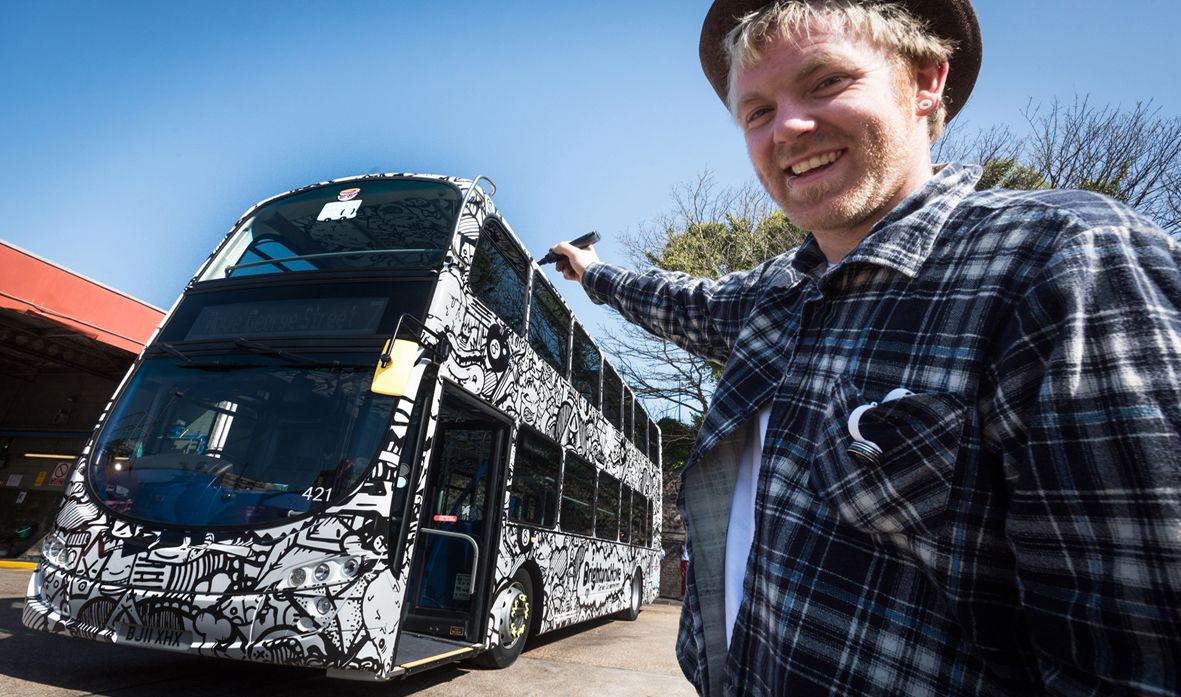
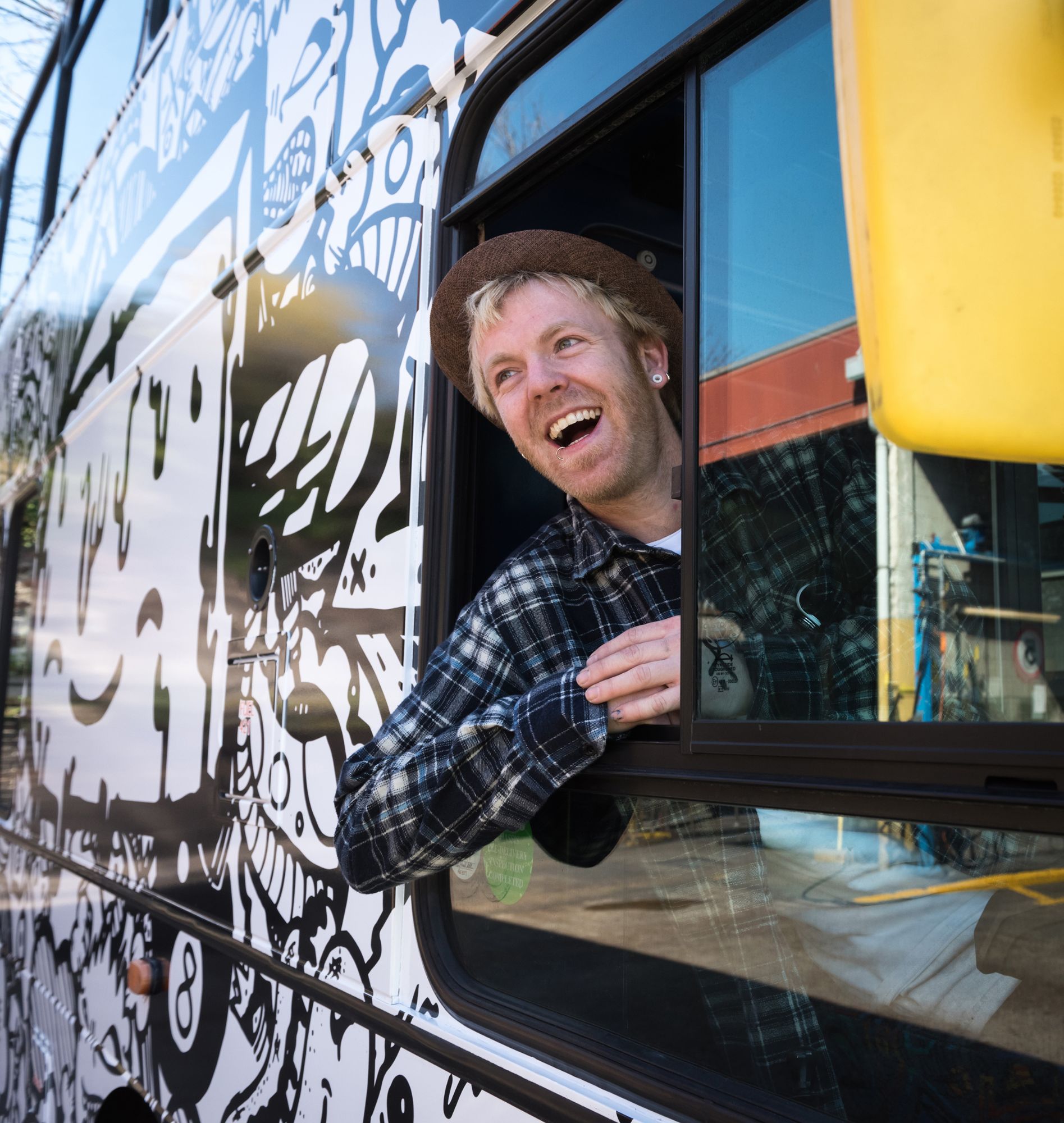
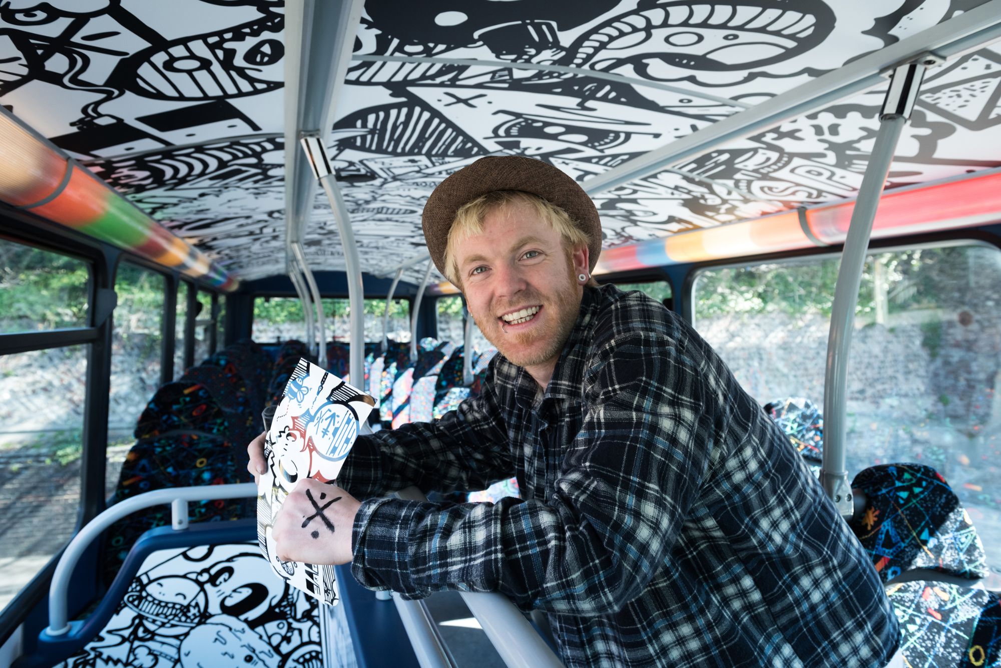
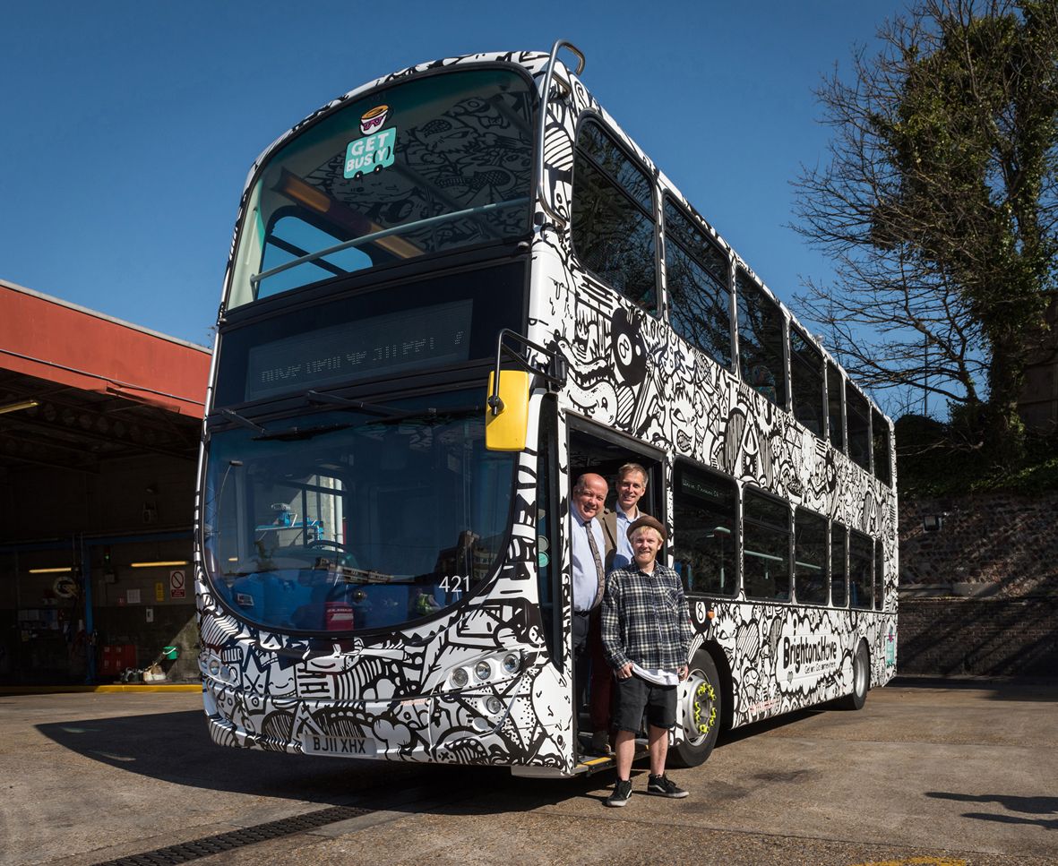
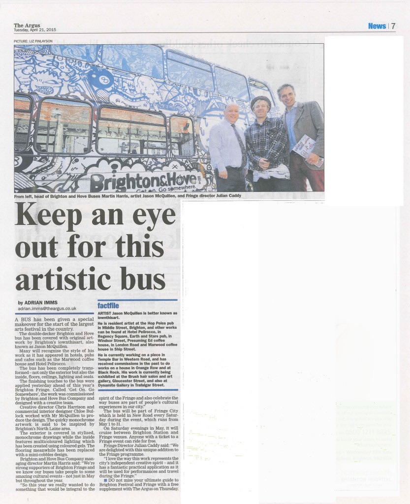
The North Laine is a much loved shopping and eating area of Brighton running from Nort Street to Trafalgar Street. It's full of independant quiry shops that make Brighton so special. Street art features heavily so the North Laine theme led us to work with local artist Jason McQuillen (aka ‘iownthisart’) whose work is much loved in the city.
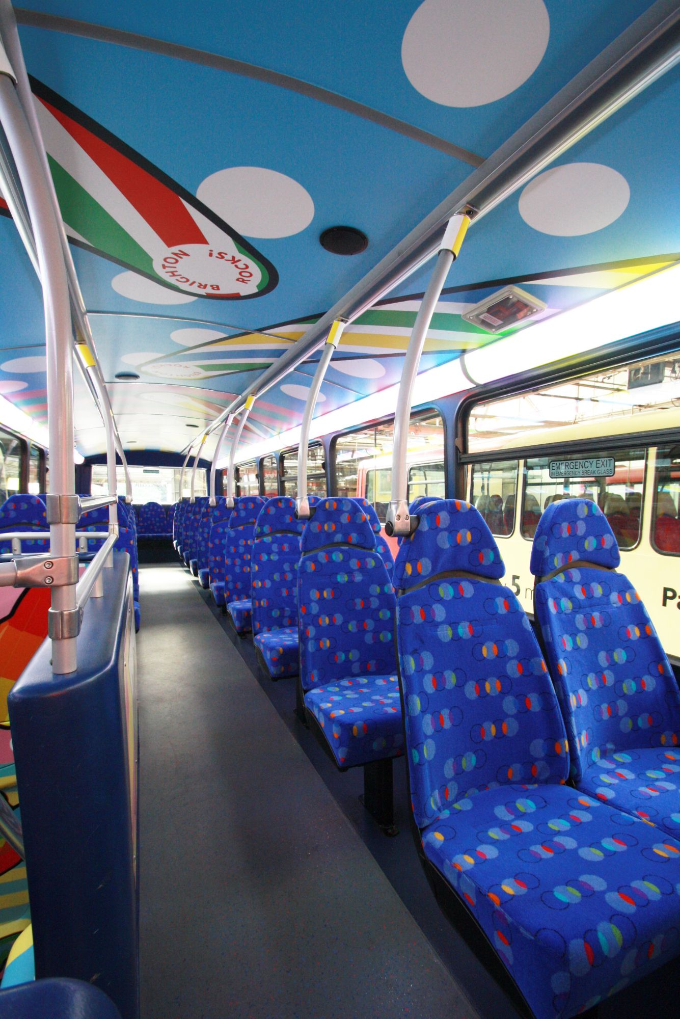
With the support of the bus company we were in the unique position of being able to carry the theme through the exterior as well as fully in the interior of the bus. This meant a full vinyl wrap exterior, with both decks having art on the ceilings, multicoloured lighting, new cobblestone vinyl floors and new moquette covered seats, as well as a fully wrapped staircase surround. This provided lots of interior design challenges as apart from the aesthetic brief, strict VOSA regulations and DDA guidelines are in place for the safety of passengers.
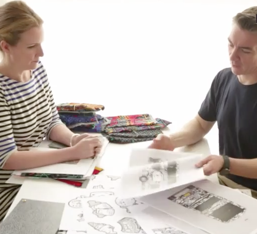
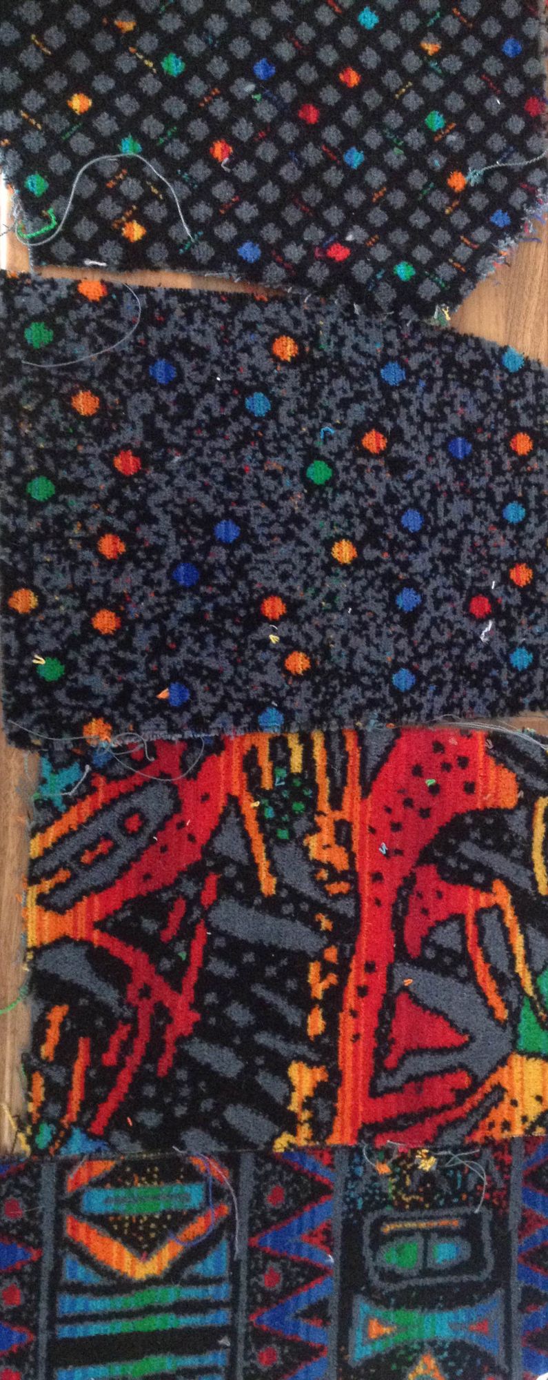
I surveyed the vehicle and produced CAD drawings for the design – specifing fabrics, finishes and lighting – working closely with specialist suppliers to ensure everything was delivered in time and to budget.
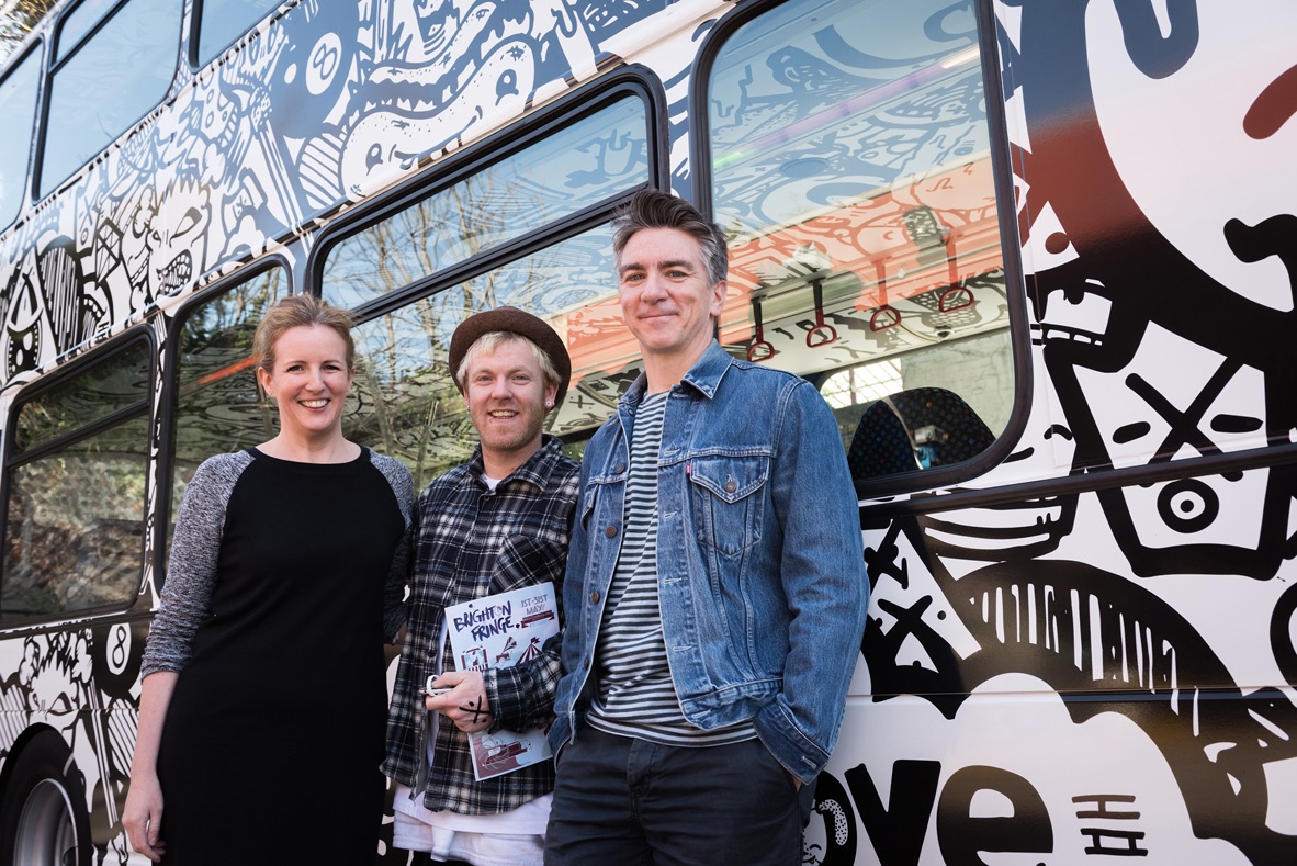
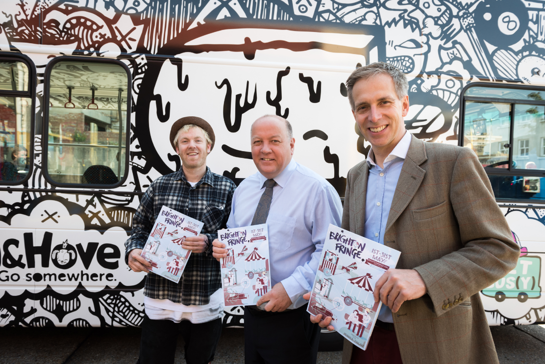
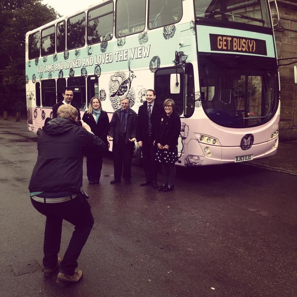
The Brighton Fringe led by Julian Caddy adopted the bus as both a venue and dedicated transport for the 2015 festival. The bus also works hard as part of the regular fleet for Brighton & Hove and is now used on all routes in the city, promoting and celebrating the role of the bus in Brighton’s creative and cultural life.
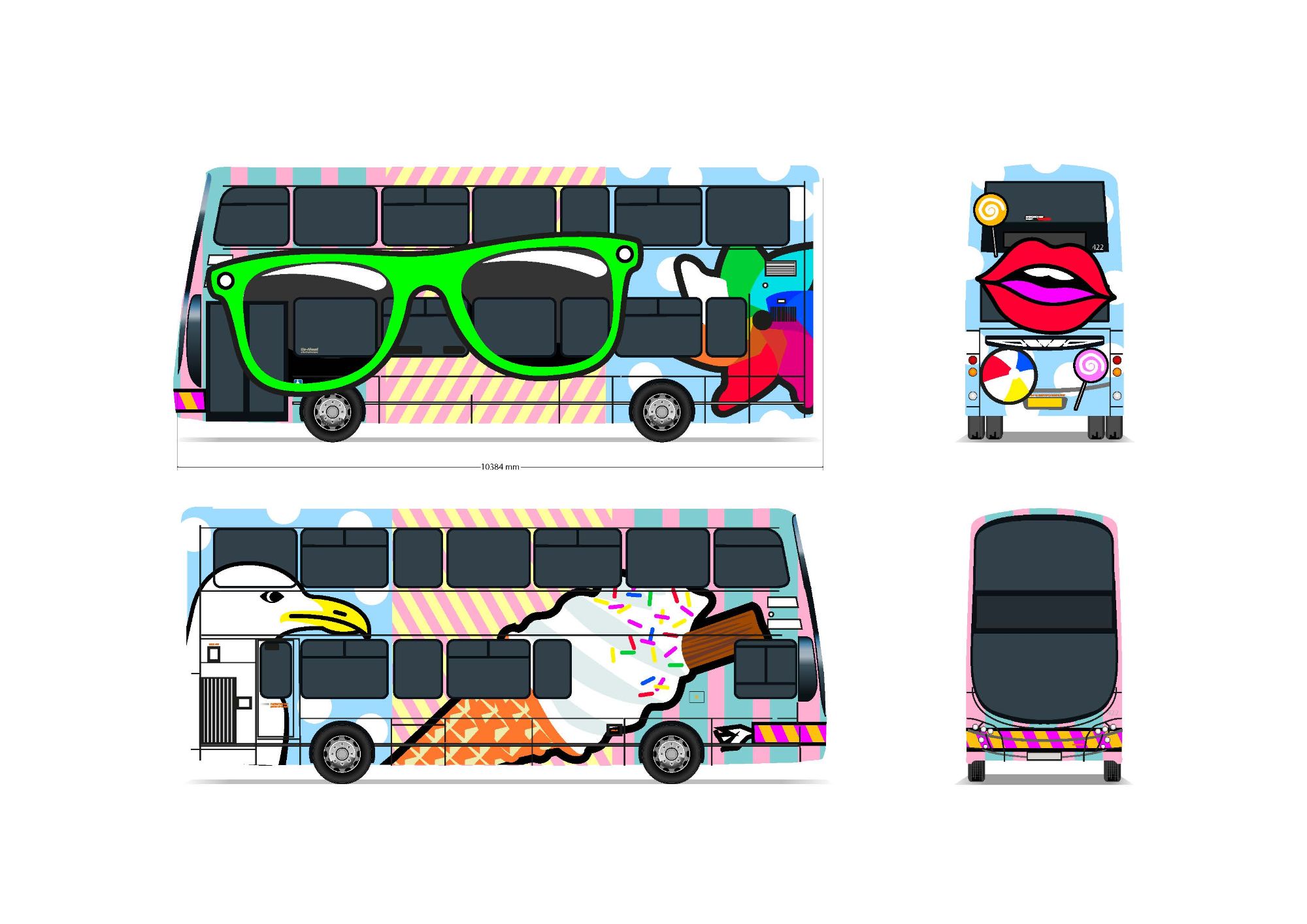
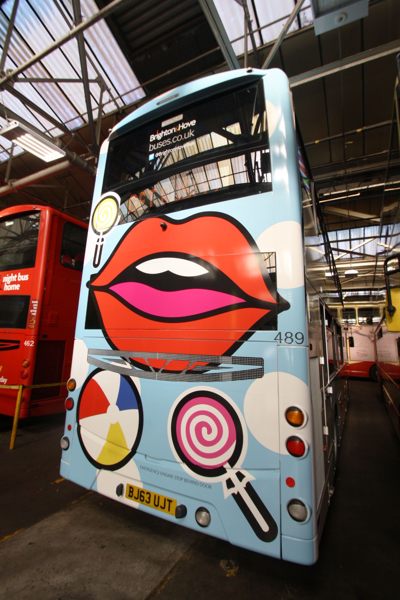
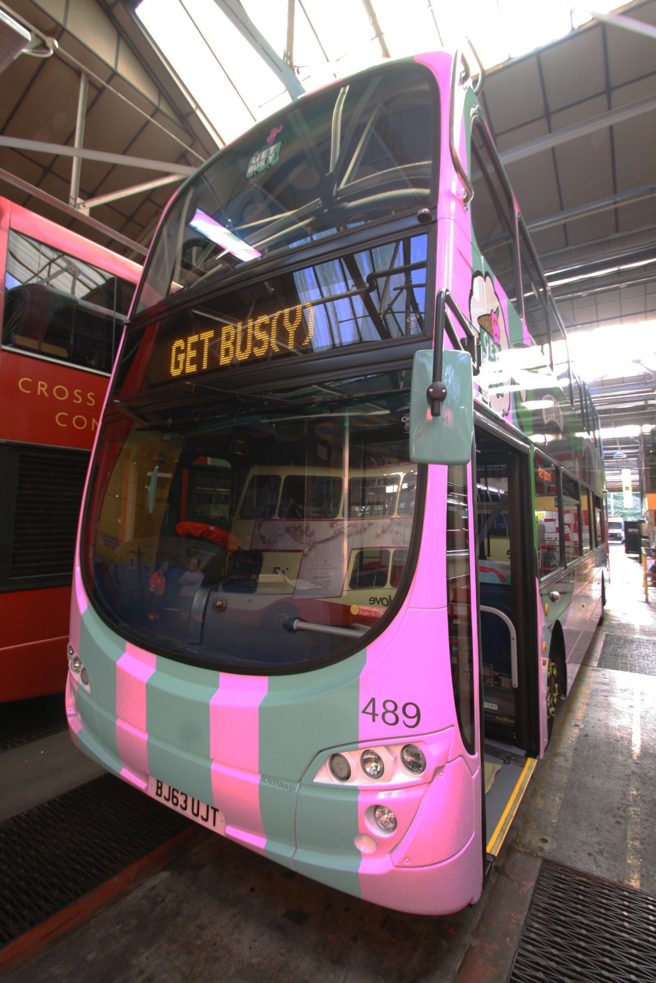
BEACH BUS
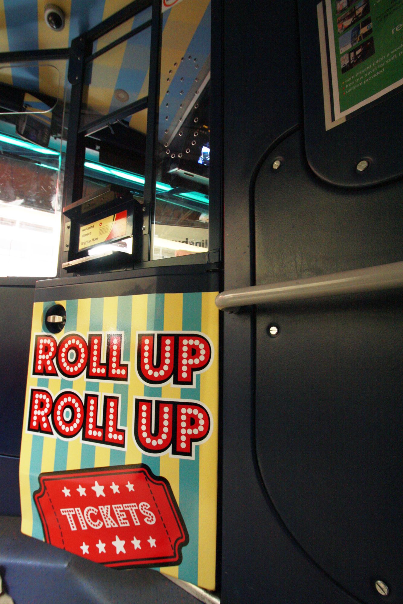
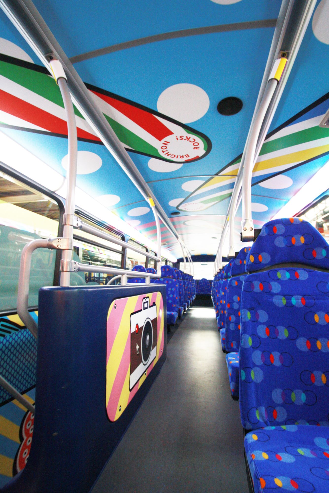
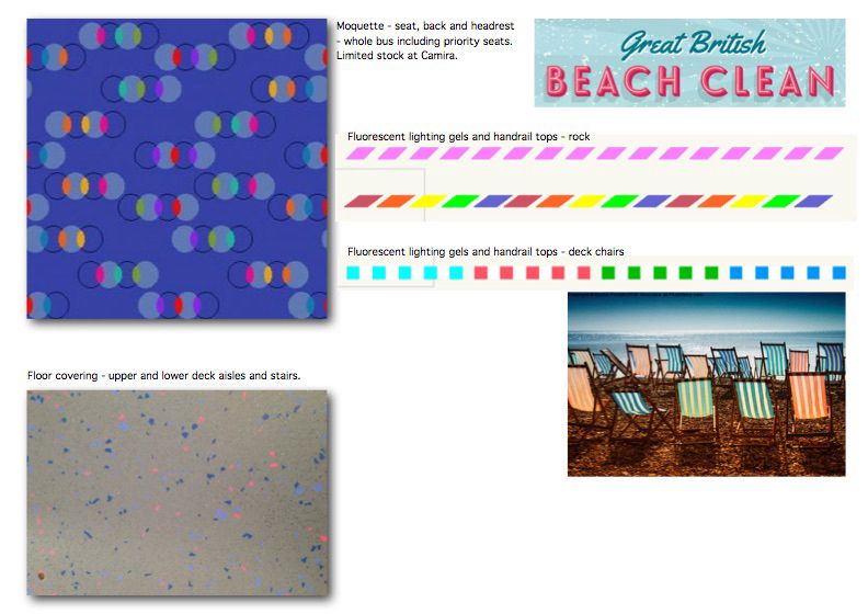
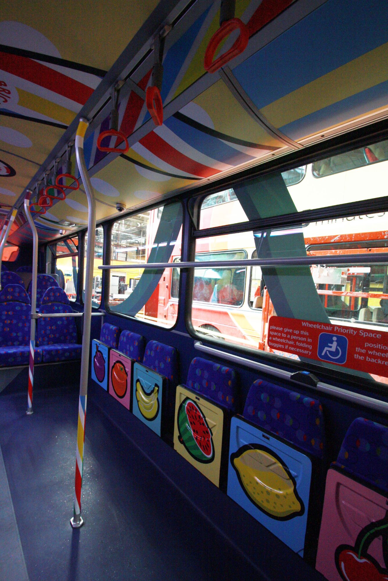
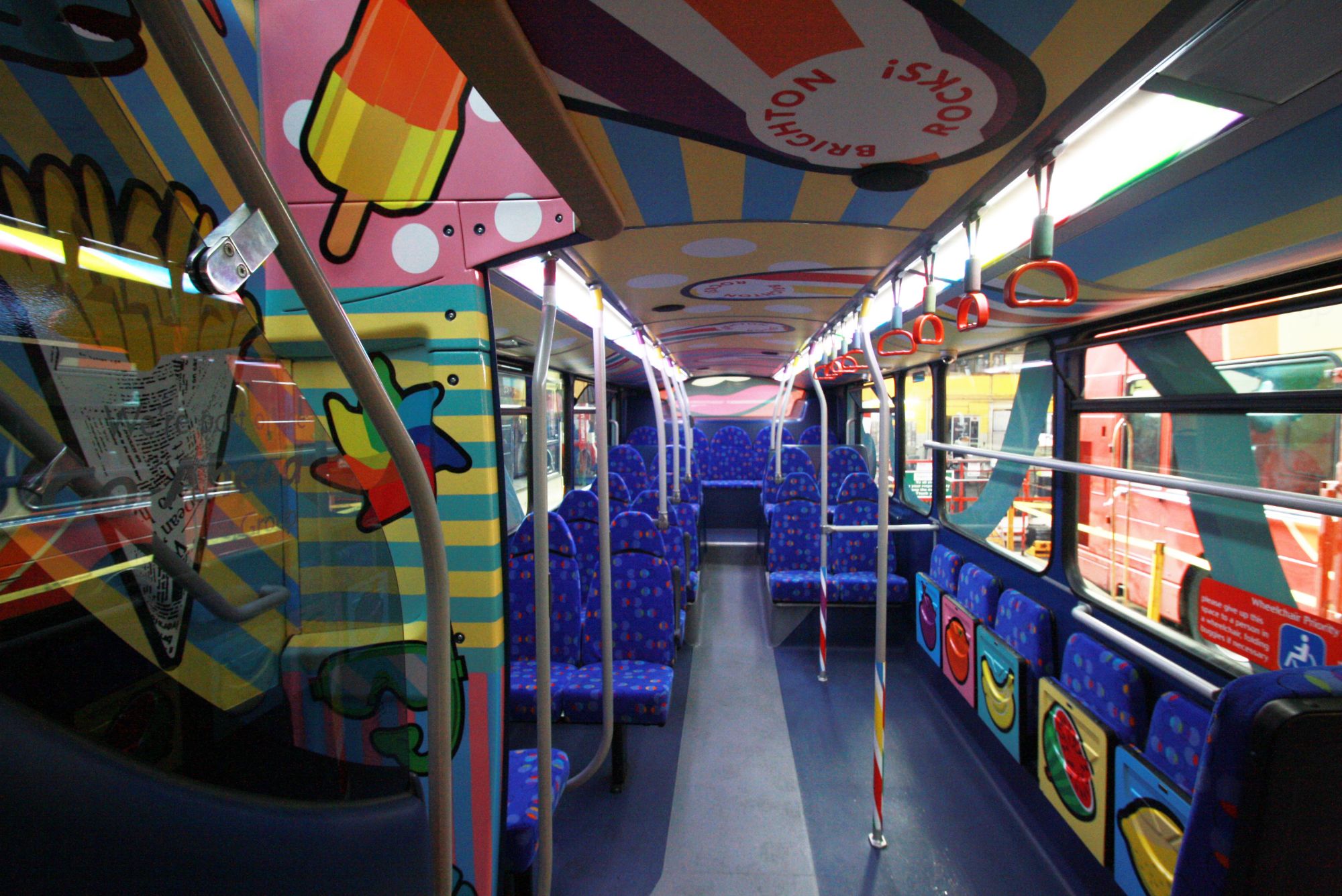
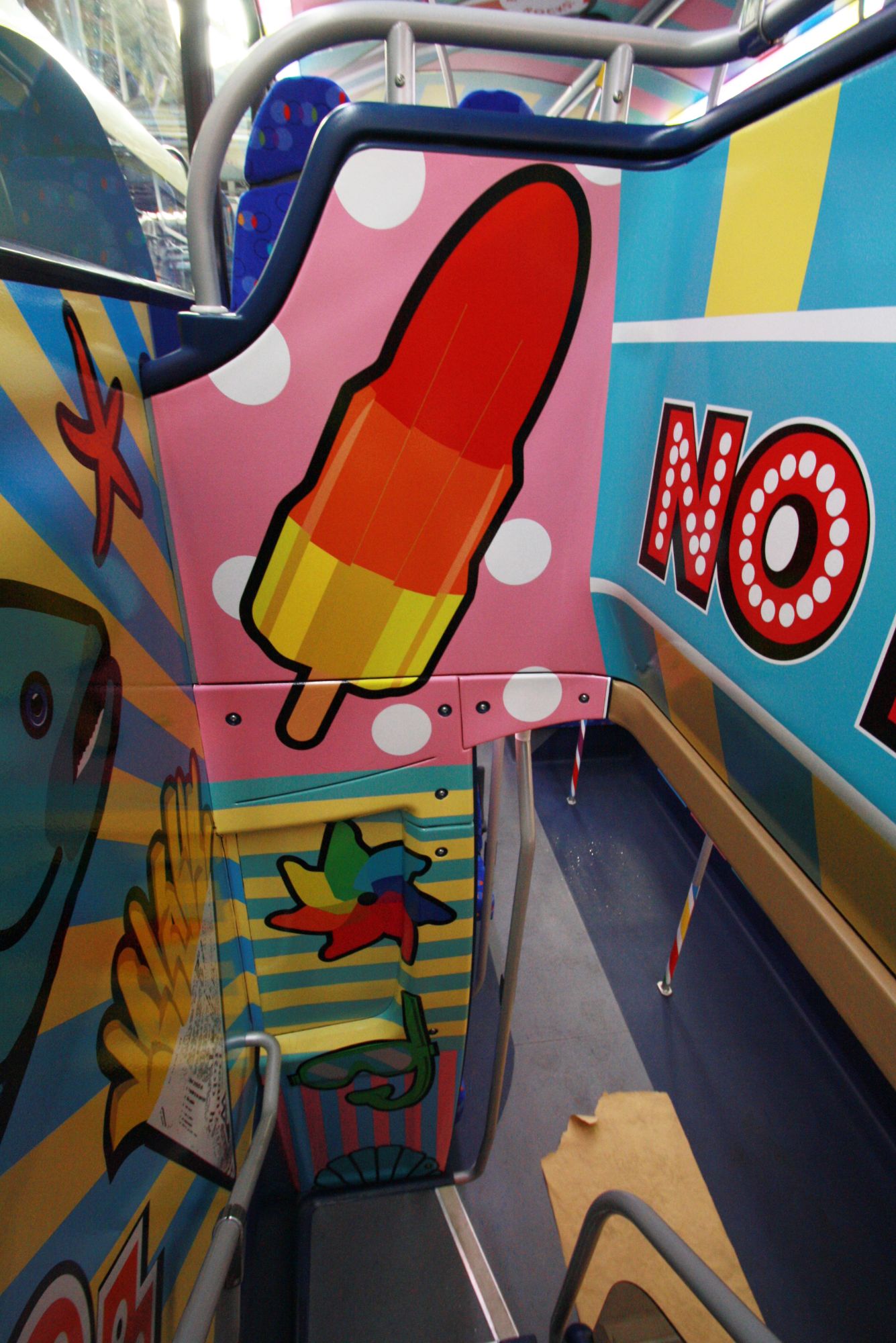
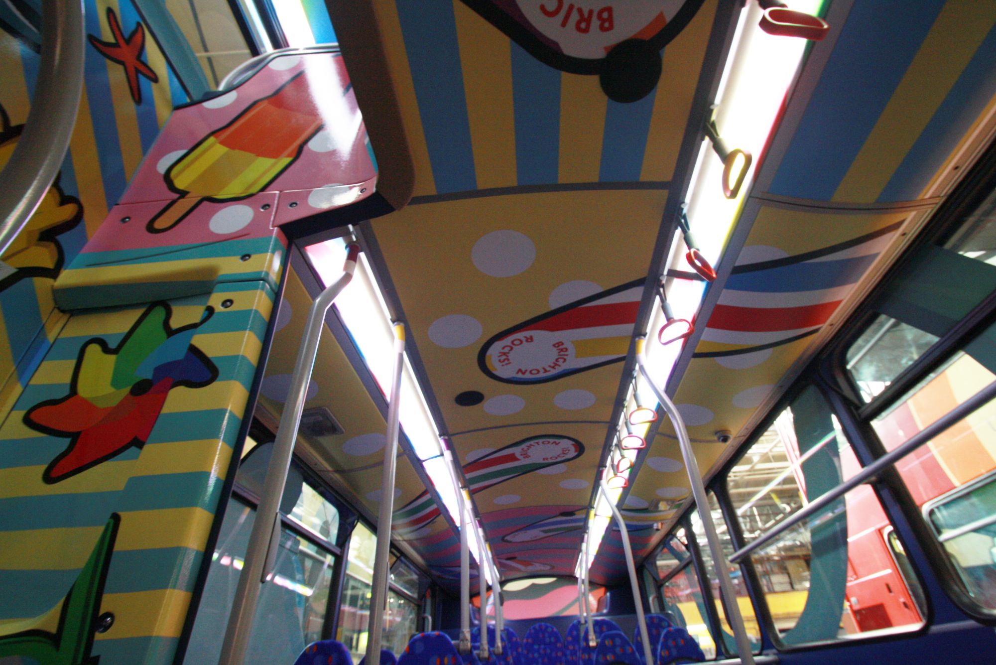
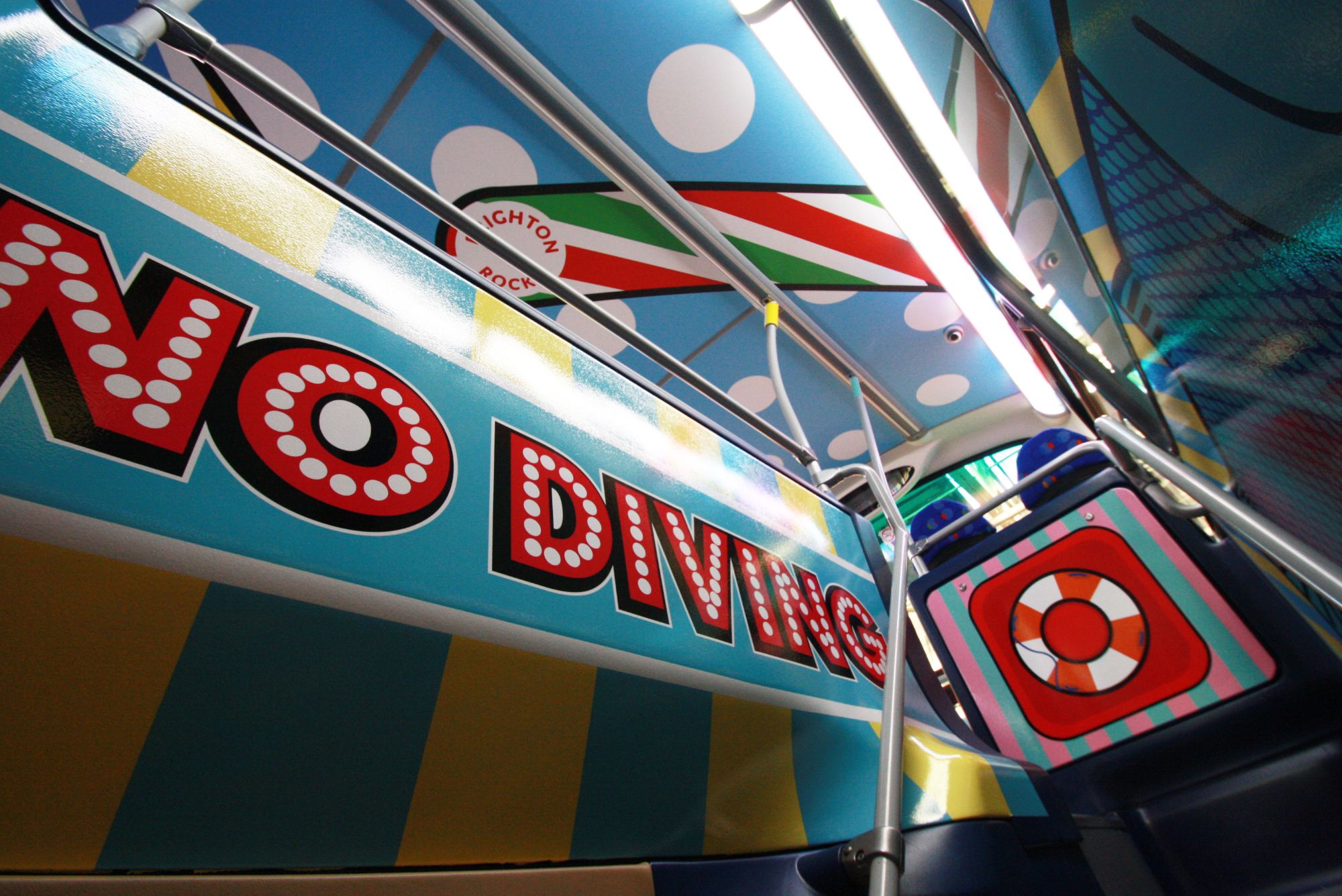
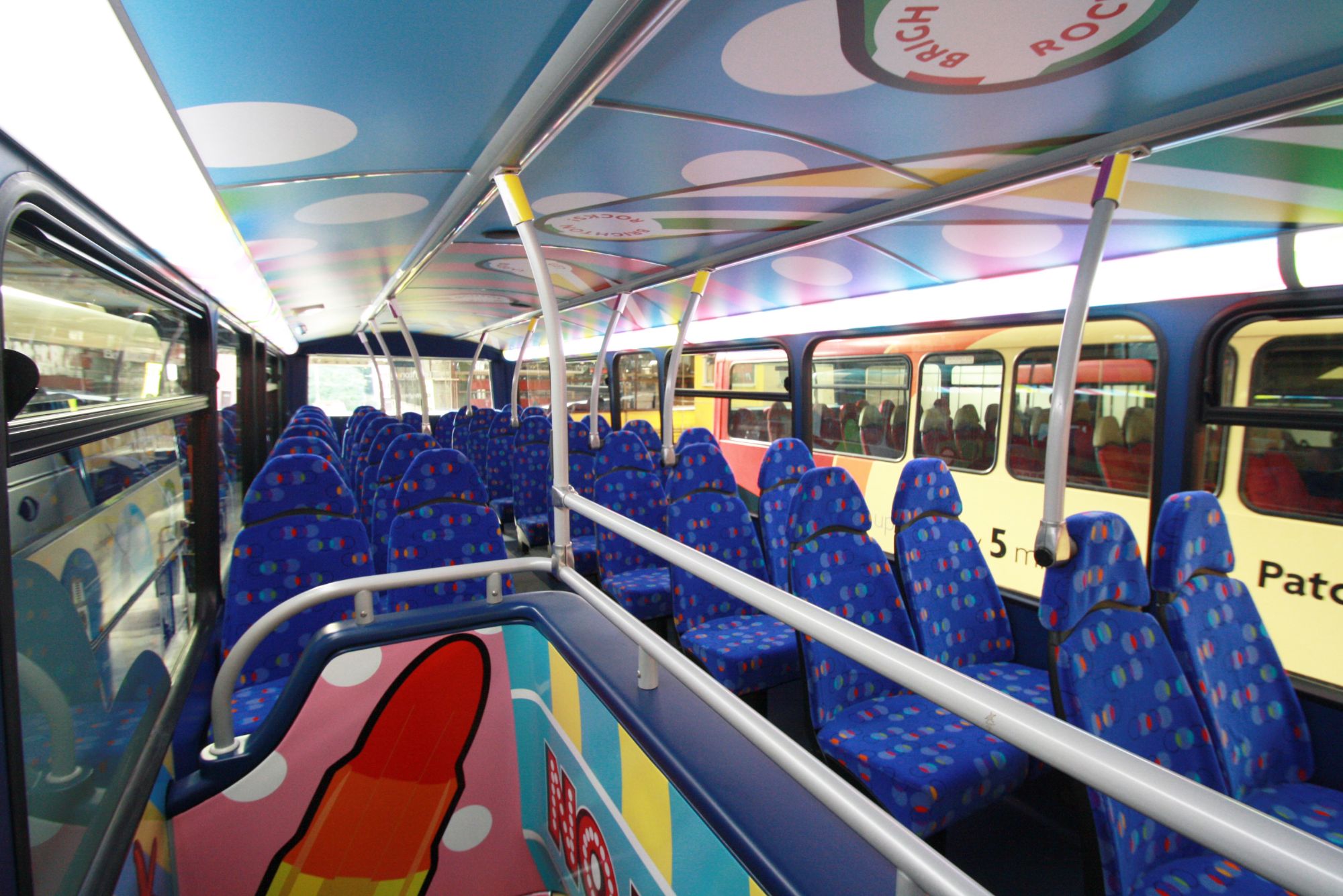
The second bus in the ‘Get Bus(y)’ series of artist-designed buses was launched in July ’15. Full of colour and fun, it is covered inside and out with bold illustrations by Harrison Agency of those seaside elements we associate with our beloved beach here in Brighton. The Beach Bus’s big, bold images – including a giant 99 ice cream, massive sparkly sunglasses, and a monster-size seagull’s head – are on a background of deckchair stripes, beach-hut colours and deco polka dots. Inside, iconic seaside images are everywhere – from fish and chips and fruit machines to swimming trunks and sticks of Brighton rock.
Again we recovered all seats with a seaside looking vintage moquette, replaced floors with complimentary floor covering and created vibrant rock stripes on the existing lighting.
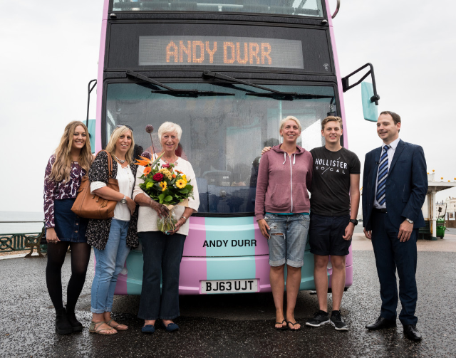
This bus is dedicated to the late Andy Durr – the much-missed former Mayor, councillor and academic who masterminded Brighton’s seafront revival, carrying his name on the front.
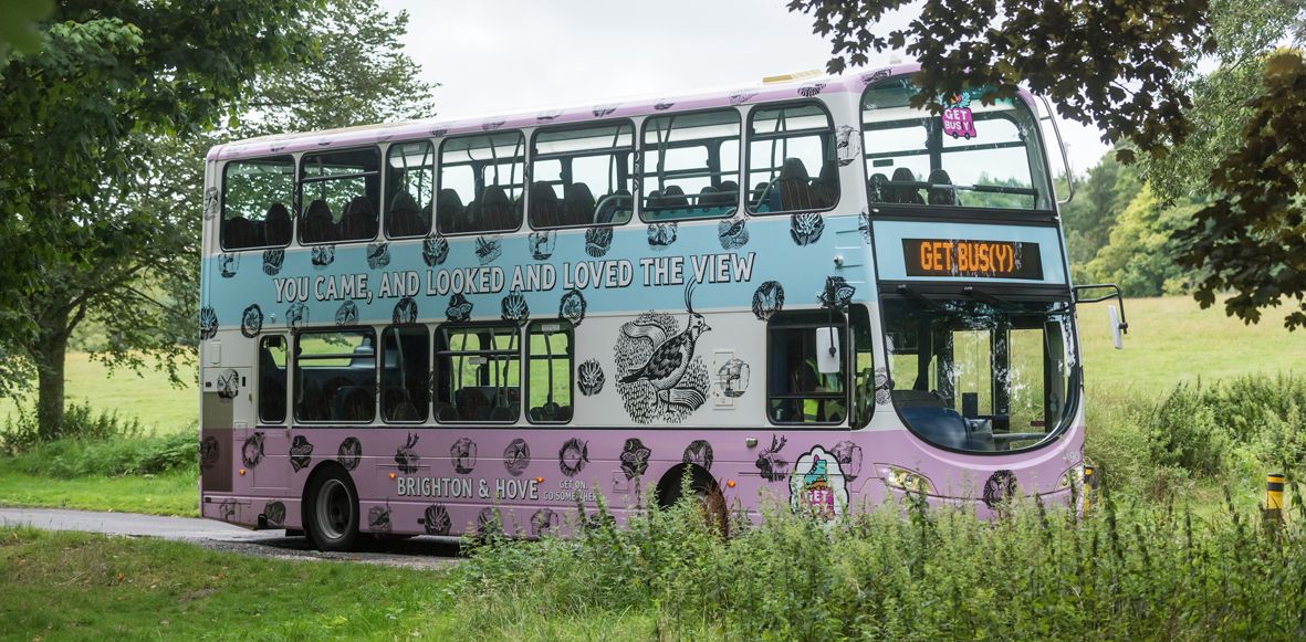
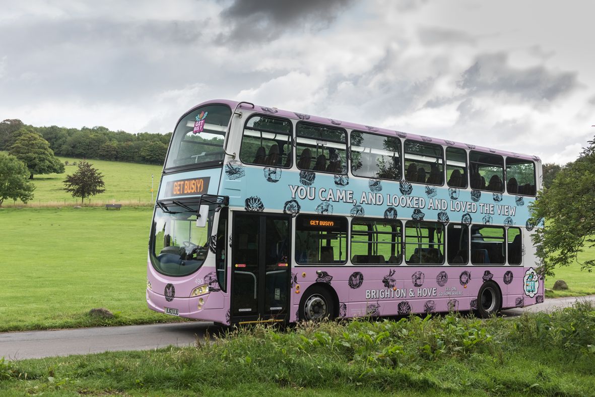
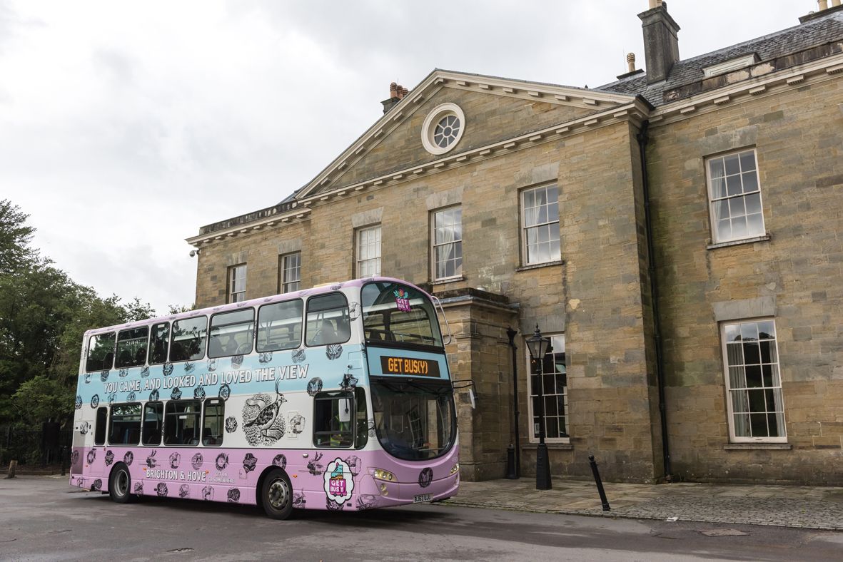
SOUTH DOWNS BUS
The third and final bus in the series was ‘South Downs’ themed and was launched in August ’15.
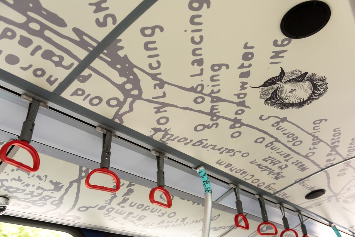
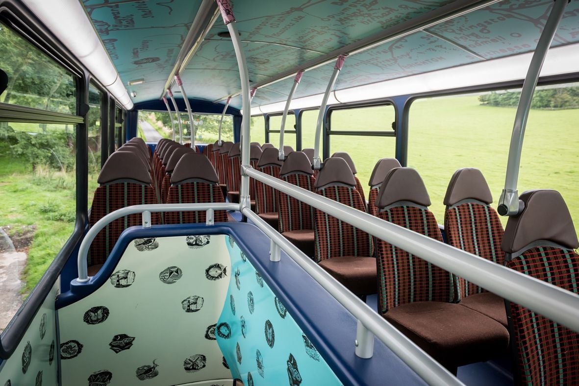
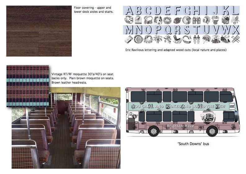
The brief was to promote our wonderful South Downs and Biosphere that encompasses Brighton & Hove. Working again with Harrison Agency we devised the concept and designed the bus both inside and out. Early on we were keen to work in the style of Sussex artist Eric Ravilious who painted drew and painted many scenes on the South Downs in the 1930’s and 40’s.
Brighton illustrator Jamie Eke drew places and species in the area in Ravilious’s wood cut style. We also used words of Alfred Lord Tennyson describing the South Downs which wrapped the bus and were used inside as well. The lettering and style used was in the style of work Ravilious did for Wedgewood. So with their permission this was used on the bus.
Yet again, I was given full access to the moquette store at Hants and Dorset Trim and we were very lucky to be able to use some vintage Routemaster moquette to fit the look for the passenger seating, coupled with dark timber floors throughout.